Scarlo: A Bold Display Font for Digital Branding
It started with a hero section—just me, a half-finished landing page for a boutique coaching brand, and that familiar moment when the headline feels… safe. Too safe. I swapped in Scarlo, typed “Clarity Starts Here,” and watched the whole layout exhale. Suddenly, the page wasn’t just clean—it had character. Edge. Intention. That’s how I discovered Scarlo isn’t just another display font—it’s a digital tone-setter.
What Makes Scarlo Stand Out in Web Layouts
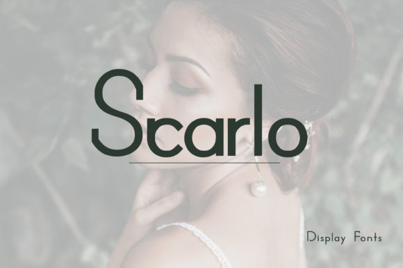
Scarlo is a modern, techno-inspired display font with sharp angles, balanced negative space, and subtle geometric tension. It’s not cold or robotic—there’s warmth in its rhythm, precision in its proportions. Think of it as the typeface equivalent of brushed aluminum meets soft ambient light: sleek but approachable, futuristic but human-centered. As a display font, it’s designed to command attention—not blend in—and it does so without sacrificing legibility at scale.
I tested it across real scenarios: a product landing page headline over a muted gradient, a CTA button on a dark-mode variant, and even as a subtle accent in a testimonial carousel. In every case, Scarlo added visual hierarchy without overwhelming supporting content. Its letterforms hold up beautifully on retina displays, and the contrast between thick strokes and open counters keeps it readable—even when placed over textured image backgrounds.
Where Scarlo Shines (and Where to Pause)
Scarlo excels where impact matters most:
- Hero headlines — Especially on portfolio sites, creative agency pages, or course sales pages where first impressions drive engagement.
- Section titles — Like “How It Works” or “Your Journey” on a coaching site—short, scannable, and memorable.
- Branded banners — For limited-time offers, launch campaigns, or seasonal promotions needing instant recognition.
- Logo lockups — When used sparingly (e.g., wordmark + icon), it reinforces a confident, forward-thinking brand identity.
- Interactive elements — Buttons, badges, and feature cards benefit from its bold presence—just avoid using it below 24px for touch targets.
That said, Scarlo isn’t built for long-form reading. I tried it for paragraph text on a blog post preview—and while it looked striking in isolation, scanning became tiring after two lines. It’s also not ideal for navigation menus, form labels, or small-screen footer links. Its personality is strong, and that strength needs breathing room. Use it where you want users to pause, not skim.
Responsive Behavior & Real-World Readability
On mobile, Scarlo holds up remarkably well—if sized thoughtfully. At 32px on iOS Safari and 36px on Android Chrome, it remains crisp and legible without crowding. I tested it over both light and dark backgrounds, and its stroke consistency meant no unexpected thinning or pixelation. One note: avoid placing it directly over busy imagery without a subtle text shadow or semi-transparent overlay—its clean geometry needs contrast to land cleanly.
For accessibility, pair Scarlo with a highly legible sans serif (like Inter, Lato, or your system’s native stack) for body copy and UI text. This pairing satisfies WCAG contrast ratios while preserving visual distinction between headline and content layers. And yes—I checked: Scarlo’s uppercase-heavy aesthetic works perfectly for short, action-driven CTAs (“Get Started,” “Join Now,” “Explore Tools”) without requiring all-caps CSS overrides.
Smart Pairing & Practical Implementation Tips
Scarlo pairs effortlessly with neutral, highly functional fonts. My go-to combo? Scarlo for headlines + Inter for everything else—body copy, captions, buttons, and microcopy. The contrast is intentional but harmonious: one font sets the mood, the other ensures clarity. For more editorial or premium-feeling sites, I’ve paired it with a restrained serif like IBM Plex Serif—the juxtaposition adds quiet sophistication without competing.
Before dropping Scarlo into a live project, I always check three things:
- Webfont delivery — Does the vendor offer WOFF2? Is there a lightweight subset option? (Scarlo includes clean WOFF2 files—no bloat.)
- Weight availability — Does it include at least Regular and Bold? (Yes—both render smoothly across devices.)
- Licensing clarity — Is commercial web use explicitly covered? (Yes—ideal for client sites, SaaS dashboards, and online stores.)
I also recommend testing fallback behavior. Set your font stack with Scarlo first, then Inter, then system fonts. That way, if loading delays occur, the hierarchy stays intact—and users never lose meaning.
More Than Just Style—A Strategic Design Asset
What surprised me most about Scarlo wasn’t how cool it looked—but how consistently it elevated perceived professionalism. On a course sales page, it made pricing tiers feel more intentional. On a portfolio homepage, it turned “Work” into “This is what we craft.” It doesn’t shout; it declares—with confidence, not noise.
For digital product creators, this matters. Your font choices silently communicate reliability, creativity, and attention to detail. Scarlo delivers that—without demanding extra design labor. No kerning tweaks needed for standard headlines. No awkward line breaks. Just plug in, adjust size and spacing, and trust it to perform.
If you’re refining a brand kit, redesigning a landing page, or launching a new digital offering, Scarlo is more than a visual upgrade. It’s a quiet signal that your work is crafted—not assembled. And in today’s fast-scrolling, high-signal world, that distinction is worth every pixel.